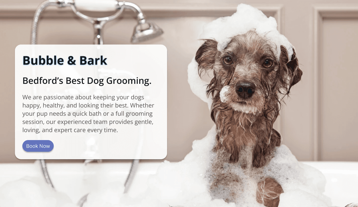
Bubble & Bark
2026
Client Work
Role: UX/UI Designer
Length: 2 Months
Team: Solo Project
Research
In order to make sure I was improving the website based off of tangible data, I employed the following methodologies:
Competitive Analysis
I researched three popular grooming websites and noted what they did/didn’t do: 1) Barkbus, 2) Petco, and 3) Dashing Dog Grooming. I compared their mission statements, their target markets, their strengths, and their weaknesses. I also was careful to pay attention to if there were any features that were common among competitors that were absent on my client’s site, or vice versa.
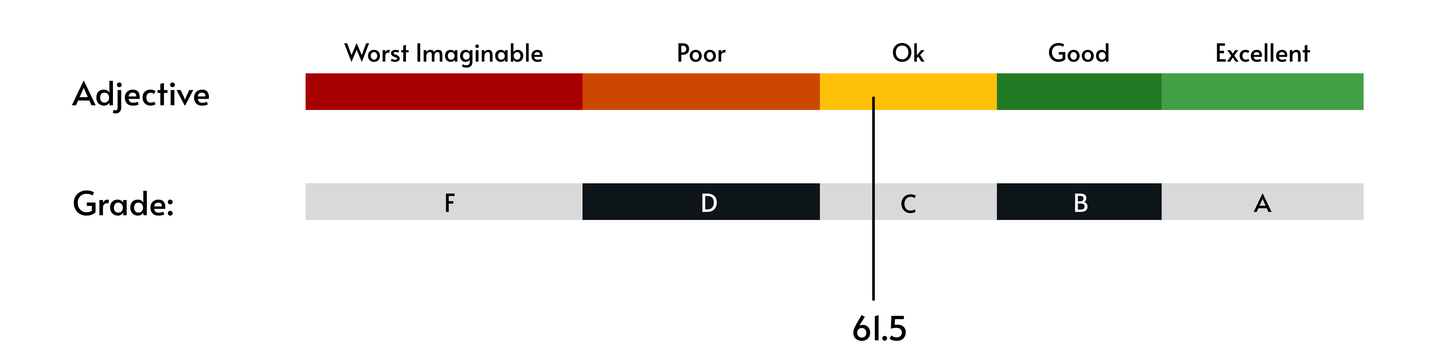
Usability Testing and The System Usability Scale Questionnaire
I conducted usability testing with five different users by asking them to complete a series of tasks that were noted to be of high importance to the client, and then asked them to complete the System Usability Scale questionnaire.
The client listed their main goals to be the following:

After conducting usability testing, these were the key findings:

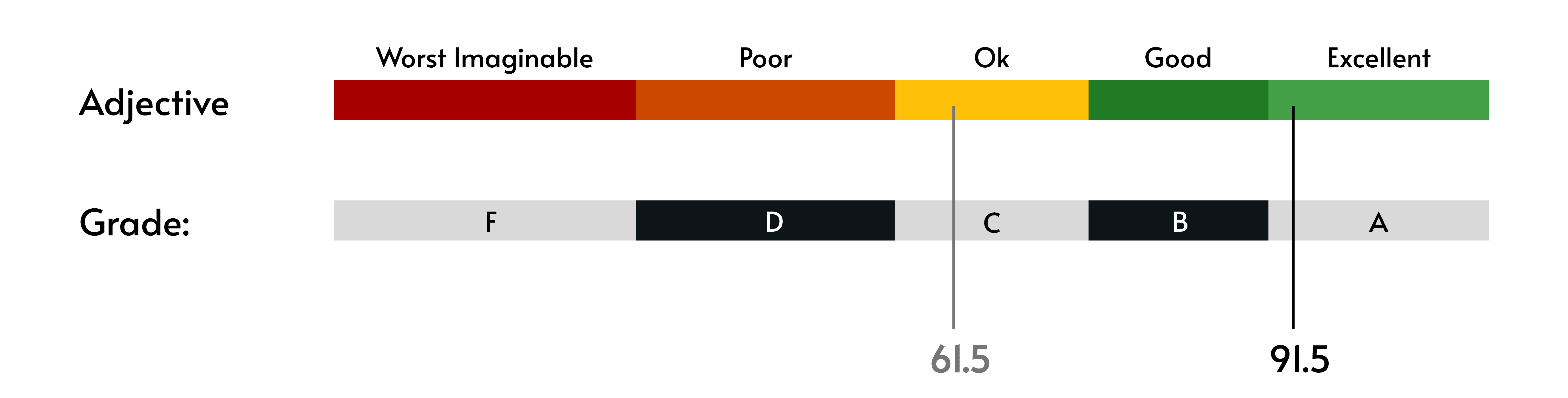
The average SUS rating for the website from the users was a 61.5.
These interviews and my research gave me a clear direction for how I could improve the usability of the site moving forward.
Opportunities and Prioritization:

Ideation
Now that I had identified the opportunities for improvement, it was time to set some goals and ensure the client and I were aligned on potential solutions.
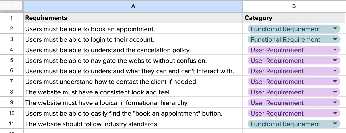
Research Report and Requirements List
I started by presenting them with my research report, so that they could familiarize themselves with the problem space. I also presented them with my first attempt at a requirement list based on not only my research, but also my understanding of their user goals, business goals, and the existing technical considerations.
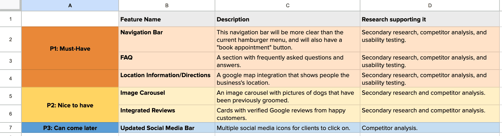
Prioritized Feature List and Style Guide
Once they approved of the requirement list, I put together a prioritized feature list and an updated style guide for their review.
They had a pre-existing logo, but were using various colors and fonts across different platforms and promotional materials. Using their brand values, I put together a cohesive style guide for their website that they could also apply to all future materials and marketing.

Wireframing and Prototyping
In order to help the product materialize, I built several mockups to get initial stakeholder buy-in before starting any major design work.
Low-Fidelity Wireframe

Once the client was happy with the skeleton, I built the first high-fidelity mockup.
High-Fidelity Wireframe

Usability Testing 2.0
I conducted usability testing again with the same five users, and asked them to complete the System Usability Scale questionnaire for the second time.
The goals for the users remained the same as from the first round:
Users can easily navigate the home page without confusion or frustration.
Users can easily find out information about the offered services.
Users can successfully book an appointment.
Users can successfully find the cancellation/no show policy.
The average SUS rating for the website from the users this round was a 91.5, which has the qualitative label of “Excellent”, and the grade level of “A”.
While this rating was incredible, and a huge improvement from round 1, there was still some room for enhancements.

Opportunities and Prioritization:

Final Design
Now all there was left to do was make the final alterations!

Comparison: The Original Design VS My Design

Conclusion
Bubble & Bark is a wonderful company with wonderful reviews, and I am so happy to have been able to help them create a website that is on par with their excellent service. I hope that with this new and improved site, they are able to serve many more dogs and reach many more owners!
